5 Rules for Refreshing Your Website
 Remember the strange and bizarre features of the early Internet days? Flash images, pop-up windows, clip art, and cheesy intro music? (Also known as the world's worst website?)
That was fun, but we're glad it's over. The most successful websites of today’s world wide web are clean, practical, user-friendly, and totally engaging – without a single pop-up window needed to make you want to click through.
Zehnder put some modern web design strategies into practice when we recently refreshed z-comm.com. Here are some of the things we changed, and what we were thinking while doing so. What do you think of the result? Let us know.
Make a good first impression.
Your homepage is often the first impression your audience will get of you and your company. A quick look at some telling before-and-after shots of some of the world’s most popular websites will show you that the look and purpose of homepages has changed quite a bit over the years.
In the past, it was okay to throw all of your website’s content on the homepage, with a bunch of links to everything you had to offer all at once.
Today, designers have to be a bit more strategic – because as the web grows, it’s more difficult to keep viewers’ attention (in fact, they’ll likely up and leave after 10 seconds).
Good homepages today serve as visually driven, enticing introductions. They host key pieces of content which urge you to explore more.
With this in mind, we redesigned our homepage to make it more visually appealing, engaging, and personal.
Keep all devices and browsers happy.
 Excellent content is worthless if nobody can see it. As browsers, search engines, and devices change and update, you need to make sure your website is agile enough to work with all of them.
For example, our last site didn't display itself very well on mobile devices or oversized computer screens – so we made some back-end changes and implemented a new site framework to fix that. Since more than 20% of web traffic comes from mobile devices these days, a mobile-ready site is a must-have.
Listen to your audience, and then speak to them.
Assuming the goal of your website – like ours – is to impress, inform, and engage with your audience, it’s helpful to know what your audience wants. This is where web traffic data comes in handy. See what makes your viewers click through, bounce away, or linger on a page, and then tailor your site to give them more of what they’re asking for.
We noticed, for example, that one of our audience’s favorite thing to click on – believe it or not – were our headshots and bios. So, when redesigning our site, we expanded our staff bio page and gave it a more visible spot on our homepage. We also highlighted our social media channels to give our audience even more access to our personality and culture.
In addition to wanting to know about who exactly who we are, we realized that our viewers liked to look at exactly what we do. Our portfolio of projects was another top-performing area of our old website, so we made sure to place it prominently in our new site.
And, of course, our contact page is readily accessible for our audience to connect with us at any time.
Keep it fresh and succinct.
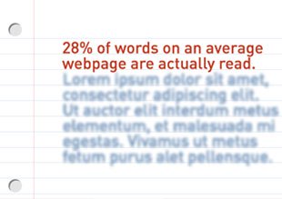
 Knowing that online readers prefer to skim, not read– and knowing that about 28% of words on an average webpage are actually read – we made sure to trim away unnecessary and outdated information from our site. That way, even if you only stick around to enjoy a few seconds of z-comm.com, we know it will be a quality few seconds.
In addition to redesigning our site to make it nice and neat, we also made some changes to ensure that our latest projects, ideas, and awards are displayed up front and on time. Not only will this fresh content keep returning visitors happy, but it will also keep Google's search engines happy.
Throw in a bit of conversation and fun.
Lastly, we’ll toss out a reminder that it’s important to remember that websites are written by people and for people – so there’s no harm in having a bit of fun and striking up a bit of conversation.
Which is why we’re offering a throwback link to our flash-tastic site of 2003, and asking you to chime in on what you like and don’t like about our new look. After all, you’re our most important critic.


